Justice Connect · Not-for-profit Law (via Symplicit)
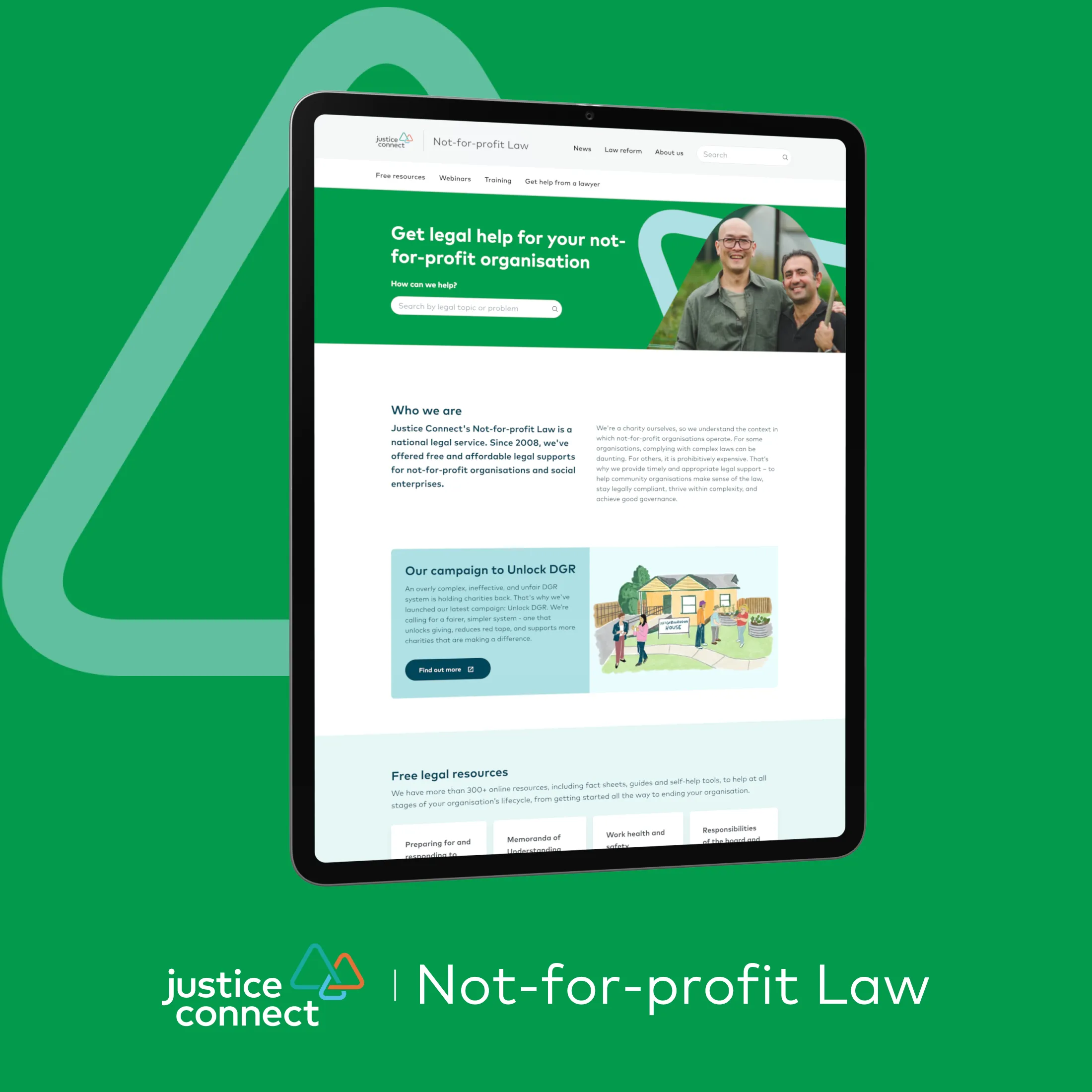
Making legal information easy to find for not-for-profits
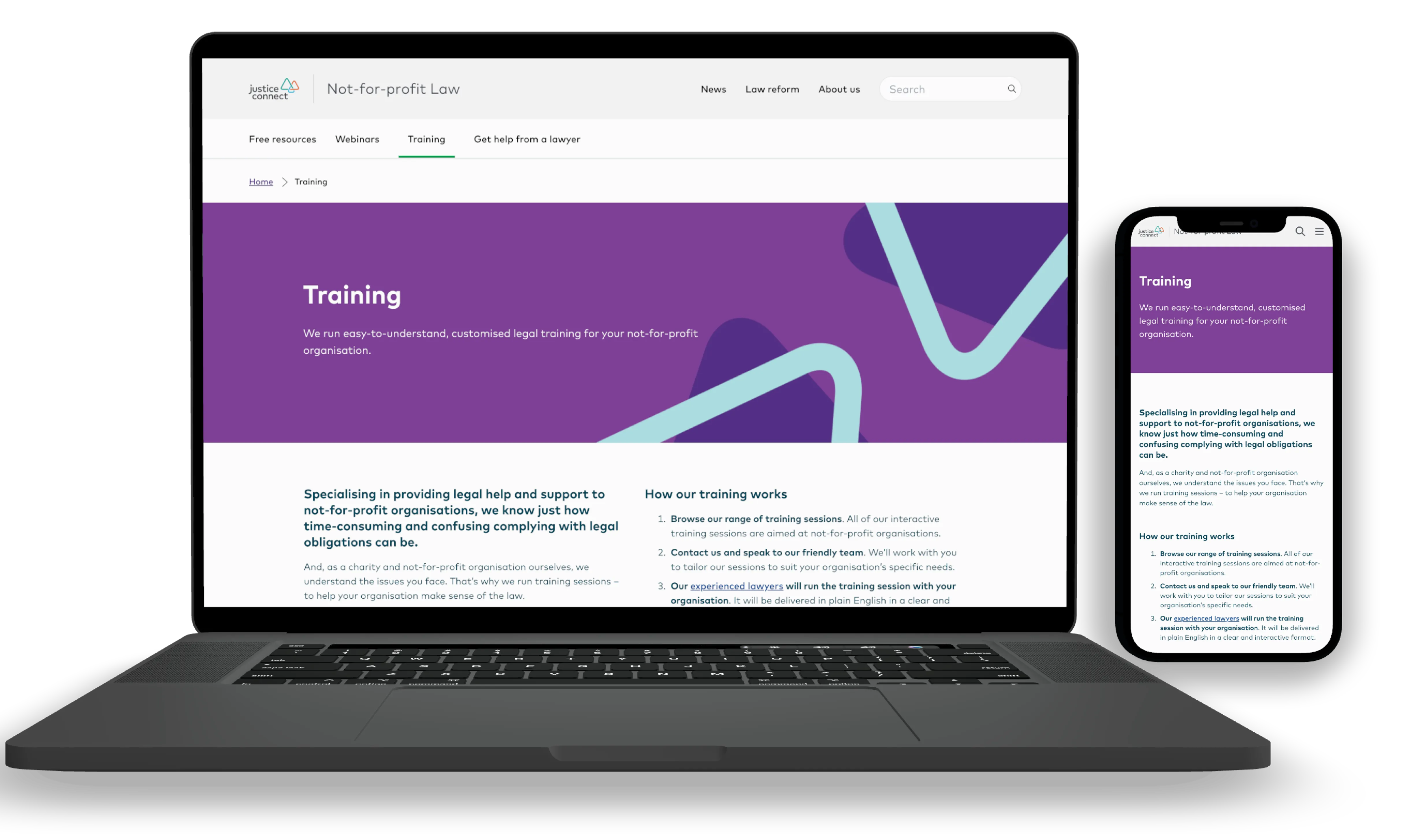
A responsive redesign that makes long, complex legal content easier to scan and navigate for time-poor not-for-profit organisations, on desktop and mobile.
- Role
- Senior Product Designer, UI design and component refinement
- Team
- Symplicit and Justice Connect, with the build team
- Timeline
- Q4 2021, joined mid-delivery
- Problem
- Not-for-profit Law publishes a huge amount of detailed legal content. People struggled to scan it, important information was buried deep in pages, and long articles were hard to navigate on mobile.
- WCAGcolour contrast across the redesigned components
- On timedelivered within the project timeline, alongside parallel development
- Reusablecomponents shared across page templates and breakpoints
The situation
Not-for-profit Law is a Justice Connect initiative that gives free legal information to not-for-profit organisations. Its pages are long and detailed, and people rely on them to make real decisions.
I joined part-way through delivery, inheriting the research, a new information architecture and Justice Connect’s design system. My focus was UI: designing and refining components, making them accessible, and working closely with developers on a responsive, production-ready build.
Constraints
- Joined mid-project, with the IA set and components only partly defined.
- Had to stay within the Justice Connect design system while giving Not-for-profit Law its own subtle identity.
- Tight timelines with development running in parallel.
- Content-heavy pages with little room to shorten the copy.
Decision 1: design for scanning long pages
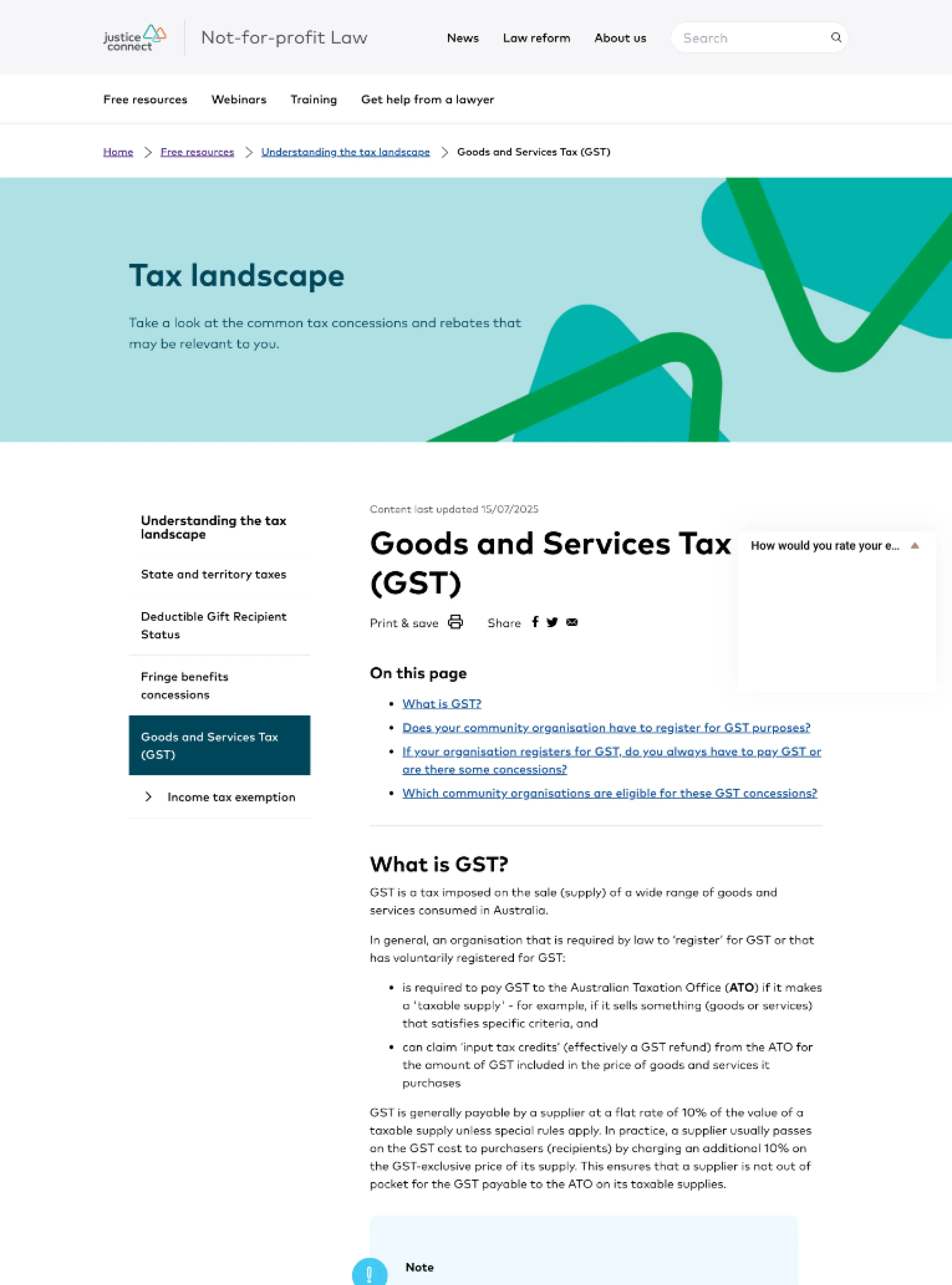
The core problem was long-form content. I introduced in-page anchor navigation for long articles, clear section dividers to give pages a rhythm, and layouts that let people jump straight to the section they need without losing their place. Returning visitors looking for a specific answer benefit most.
Decision 2: one grid and hierarchy everywhere
Every page uses the same grid across breakpoints, with a strong heading structure, consistent spacing and clear grouping. On mobile the layouts keep the same hierarchy, so nothing important disappears on a small screen. Components were built to be reused across templates, which kept development efficient.
Accessibility by default
I checked colour contrast against WCAG, balanced the brand typography with legibility, and specified keyboard and screen reader behaviour for each component. We validated these with developers during handover and build.
Working with developers
I worked with the developers throughout rather than handing over at the end. That surfaced component behaviour, responsive states and spacing issues early, and cut rework during the build.
- FigmaOn this pageOn this pageWhat is GST?Do you have to register?Are there concessions?DefaultHoverFocus
DesignComponents spec’d with states and spacing
- ZoomDDesigner</>Developer
- Keyboard and focus order
- Behaviour on mobile
- Spacing on the grid
Review togetherBehaviour agreed before the build
- StagingOn this pageWhat is GST?Do you have to register?Are there concessions?On this pageWhat is GST?Do you have to register?
Build and checkChecked on every breakpoint, fed back into design
Outcome
The redesign makes complex legal information easier to find, scan and understand. It stays true to the Justice Connect system while giving Not-for-profit Law an approachable identity of its own, and it shipped on time with reusable components.
What I learned
- Structure is the product on content-heavy sites. Hierarchy and navigation did more for usability than any visual flourish.
- Bring developers in early. Agreeing behaviour and states up front made the build faster and the result more consistent.