SA Water · mySAWater customer portal
A water account that puts the next action first
Redesigning the portal South Australians use to view, pay and manage their water account, around the tasks they come to do and SA Water's refreshed brand.
- Role
- Lead UX and UI designer, from proof of concept to final designs
- Team
- Cross-functional SA Water project team
- Timeline
- Proof of concept through to high-fidelity designs and pattern library
- Problem
- The portal worked but was hard to navigate. Terminology was inconsistent, key actions like paying and viewing bills were hidden, and any redesign had to fit existing backend constraints and meet WCAG.
- 75System Usability Scale score, rated good
- 1 stepfewer to reach property actions for single-property customers
- Pattern librarycreated beyond scope so future features stay consistent
The situation
mySAWater lets residential customers view, pay and manage their SA Water account online. Since it launched, SA Water’s brand had been refreshed, and the portal had become difficult to navigate. I led the UX and UI from proof of concept to final designs.
What the audit found
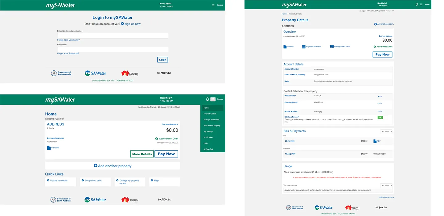
- Single-property customers took an extra step. They had to click “More details” to reach their property actions. Those actions could show straight after login.
- Desktop navigation was hidden. The menu sat behind a hamburger icon on large screens, making it harder to find things.
- Calls to action were weak. Key buttons didn’t stand out enough to guide people.
- New features were coming. The design had to leave room for them without reworking navigation.
The refreshed brand also had to meet WCAG 2.0, so I adapted the new colours for contrast before designing screens.

Blues
- #007AC9R 0 · G 122 · B 201
- #0046ADR 0 · G 70 · B 173
- #003C69R 0 · G 60 · B 105
Greens
- #76D750R 118 · G 215 · B 80
- #00AE65R 0 · G 174 · B 101
- #007D57R 0 · G 125 · B 87
Neutrals
- #E0E1DDR 224 · G 225 · B 221
- #BCBDBCR 188 · G 189 · B 188
- #747678R 116 · G 118 · B 120
- #252C26R 37 · G 44 · B 38
Error messaging
- #DC3545R 220 · G 53 · B 69
Decision 1: task first, not everything at once
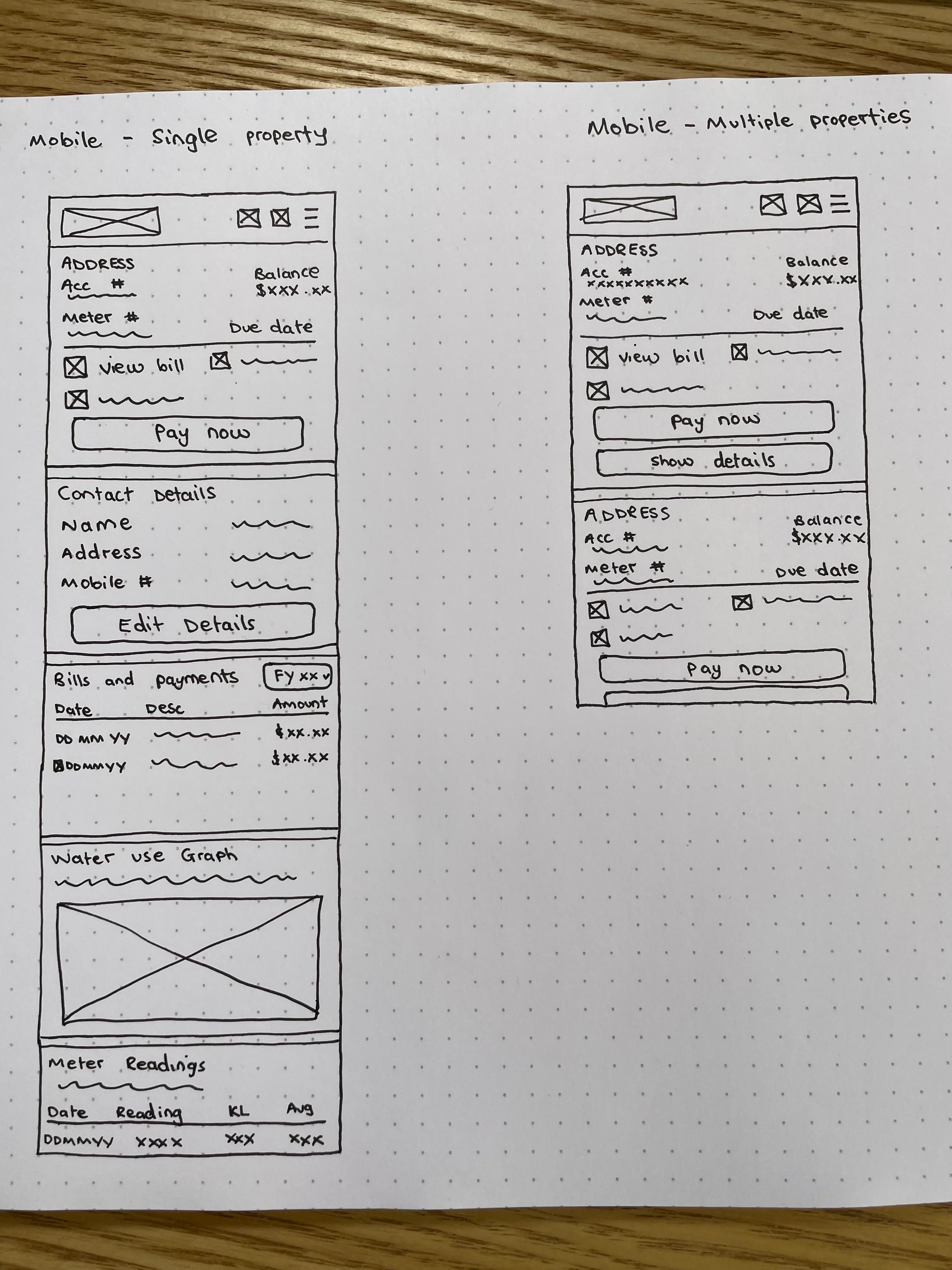
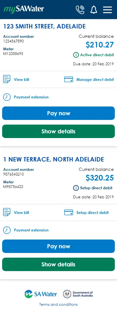
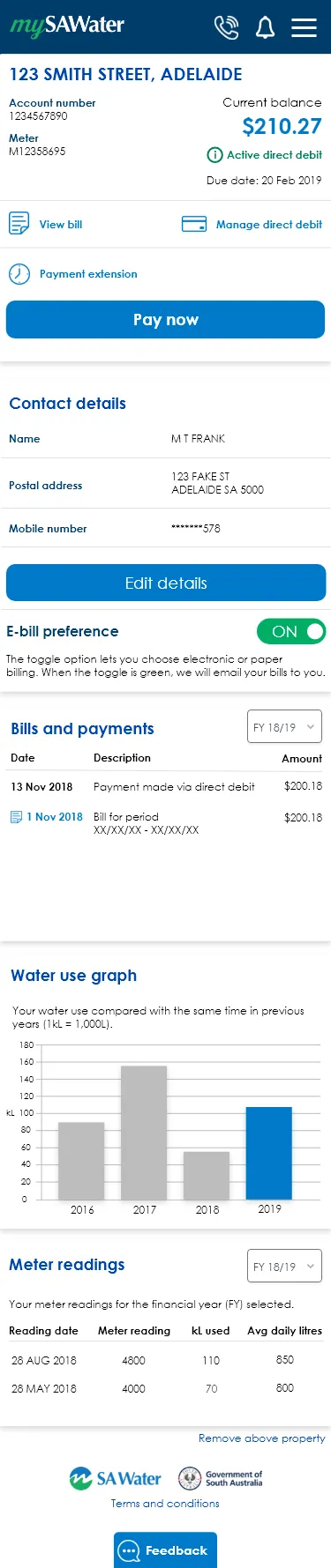
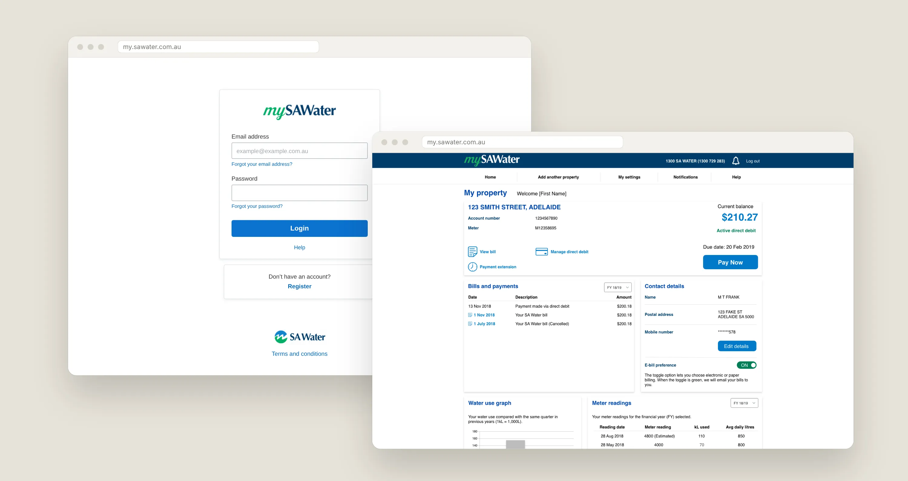
Early sketches put all account information up front. Testing showed that overwhelmed people, so I moved to a task-first dashboard that surfaces only the most relevant information and actions, such as your balance, due date and Pay now.
Decision 2: test in mid-fidelity, fix early
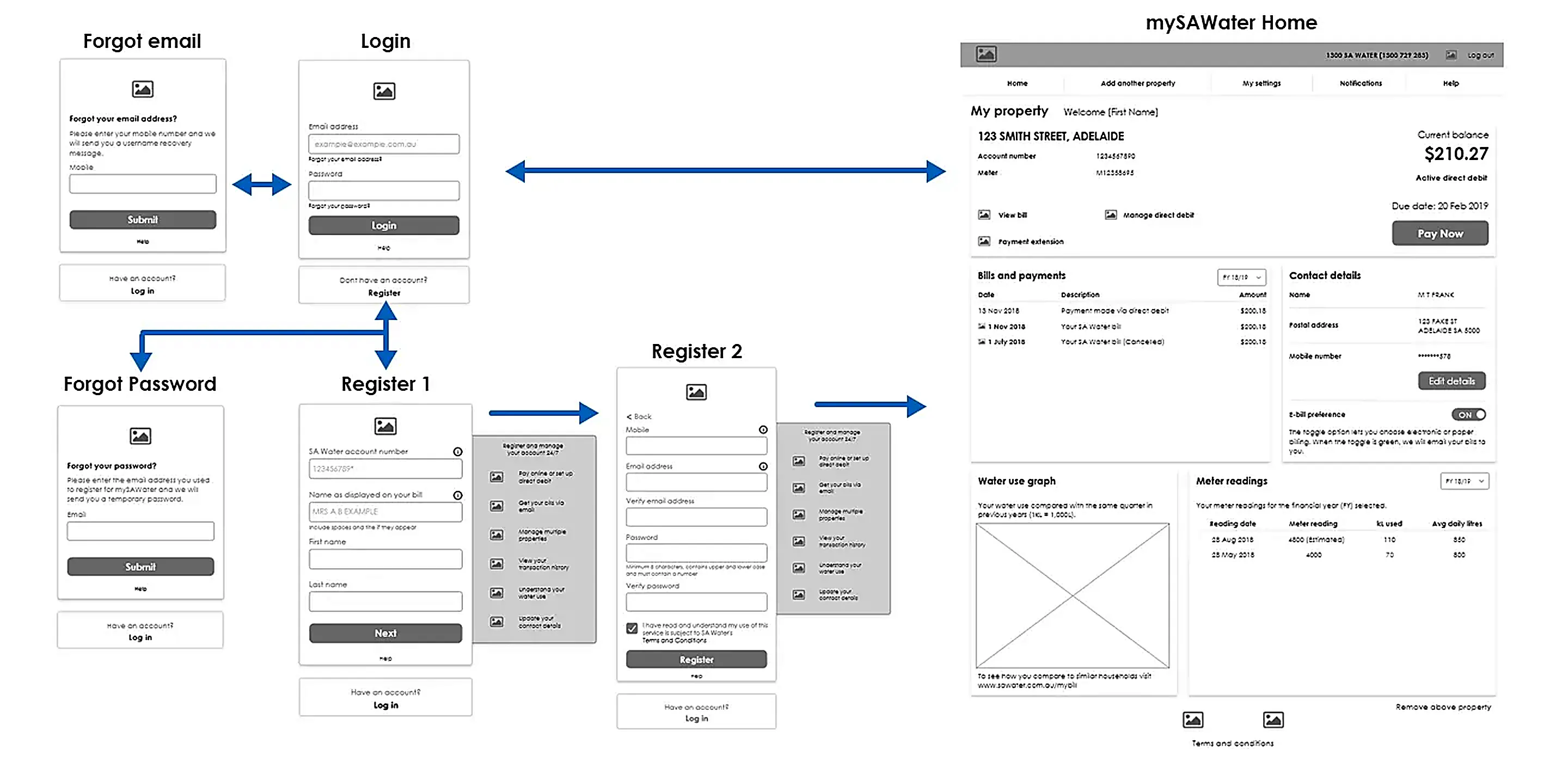
I wireframed the updated flows in mid-fidelity and turned them into clickable prototypes for customer testing. Testing refined the navigation labels and moved billing actions higher on the dashboard, before any visual design was locked.
High-fidelity design
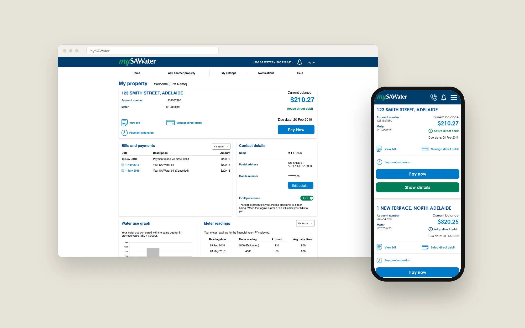
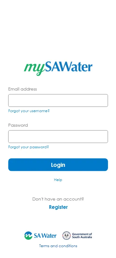
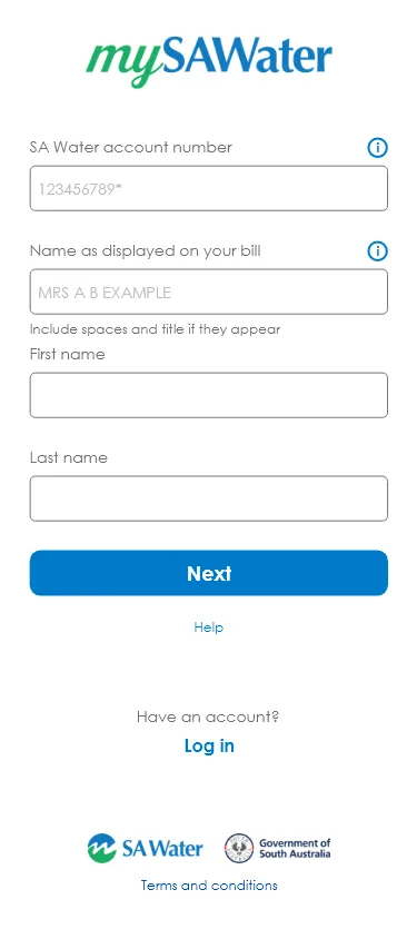
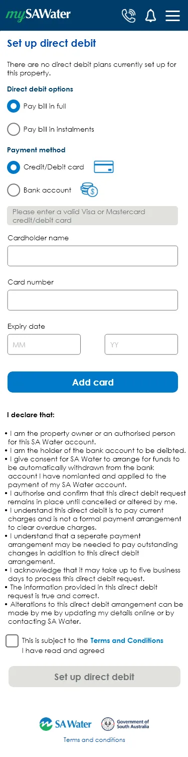
Once the flows were validated, I designed the key screens for mobile and desktop, refining hierarchy, layout and interaction details.
Going beyond the brief: a pattern library
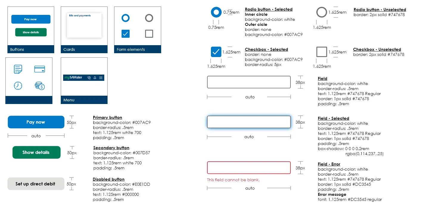
It wasn’t in scope, but I created a pattern library so future development stays consistent with the final designs and new features can be added without drift.
Outcome
The redesign made customer actions clearer, removed confusing terminology, and made managing water use and payments more intuitive. Its structure leaves room for new features without changing the core navigation. mySAWater scored 75 on the System Usability Scale, a good rating.
What I learned
- Test words and icons, not just layouts. Testing with customers uncovered labelling issues we would never have guessed.
- Know the roadmap early. Understanding upcoming features shaped decisions up front and avoided redesign later.