NAB white label lending · Qantas Money, Coles, Kogan, MyCard
One platform, every brand
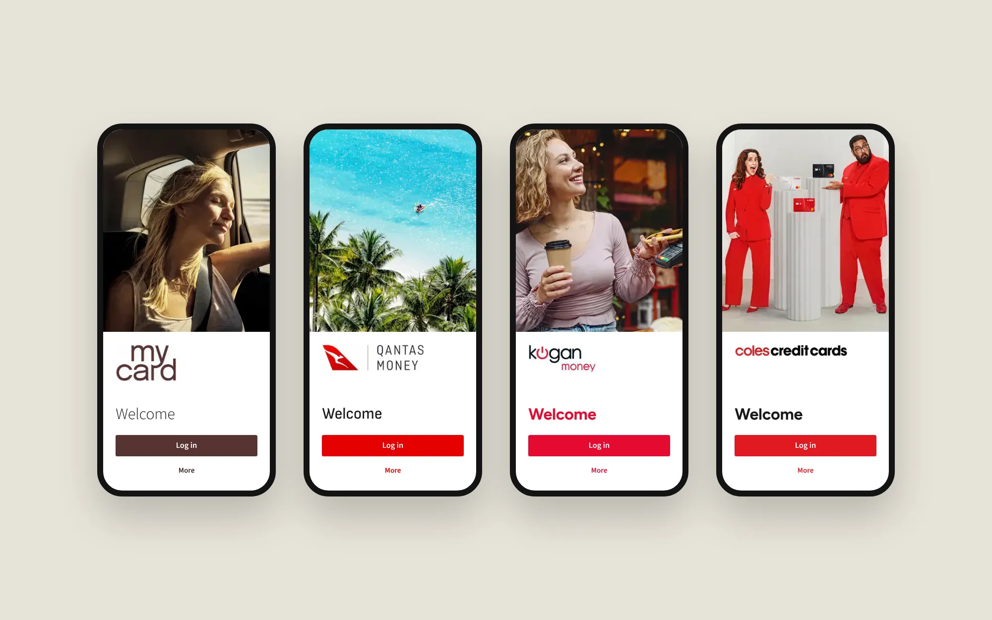
One lending platform, across app and web, that powers four partner brands from a single design and component foundation.
- Role
- Senior Product Designer; owned the theming framework and design system quality
- Team
- A design team of 15–20, plus product, engineering and partner brand teams
- Timeline
- 2022 to end of 2025
- Problem
- Every new partner meant redesigning and rebuilding the same lending experience. NAB needed one system where brand is a variable, not a rebuild.




- 4partner brands on one design and component foundation
- 30 minto see a new partner's full product, down from restyling every screen by hand
- 4design awards, including a Good Design Award and two Better Future golds
The brief
Design one white label lending platform, across app and web, that could power Qantas, Kogan, Coles and any future partner. The business principle was “one way, same way”: whatever we built had to behave the same for every brand on every surface.
That made it a systems problem first. A single typography or component change would cascade to every partner at once, and we had to design for partners we hadn’t met yet.


Design approach
The team worked to a Customer Obsession framework: a continuous loop of self, team and customer validation. It suited a problem of this scale. Committing too early to high-fidelity decisions across a multi-brand system would have been costly to unwind, so nothing progressed until it cleared a quality gate, and each stage built confidence before the next.
Customer Obsession
Continuous improvement process
Decision 1: brand as a variable
The obvious path was a Figma file per partner. It’s quick for the first two and unmaintainable by the fifth. I built a theming framework on design tokens and aliases instead, separating brand identity from component structure: design a component once, theme it for anyone.
- Brand tokens and aliases live in one place and keep every partner file in sync.
- Switching brands never touches the underlying components.
- A system change cascades to all brands at once, so designers spend their time on experience, not re-skinning.
Before the template, showing a new partner meant detaching components and restyling every screen by hand. Now their brand assets go into the template and their full product experience can be visualised in about 30 minutes.
1Brand tokens
2Aliases
action.primaryqantas.primaryhero.surfaceneutral.whitefont.brandAaqantas.fontbrand.logoqantas.logocard.artqantas.card
Components only ever point here, never at a brand.
3Components







Built once. They never change between brands.
4Themed product
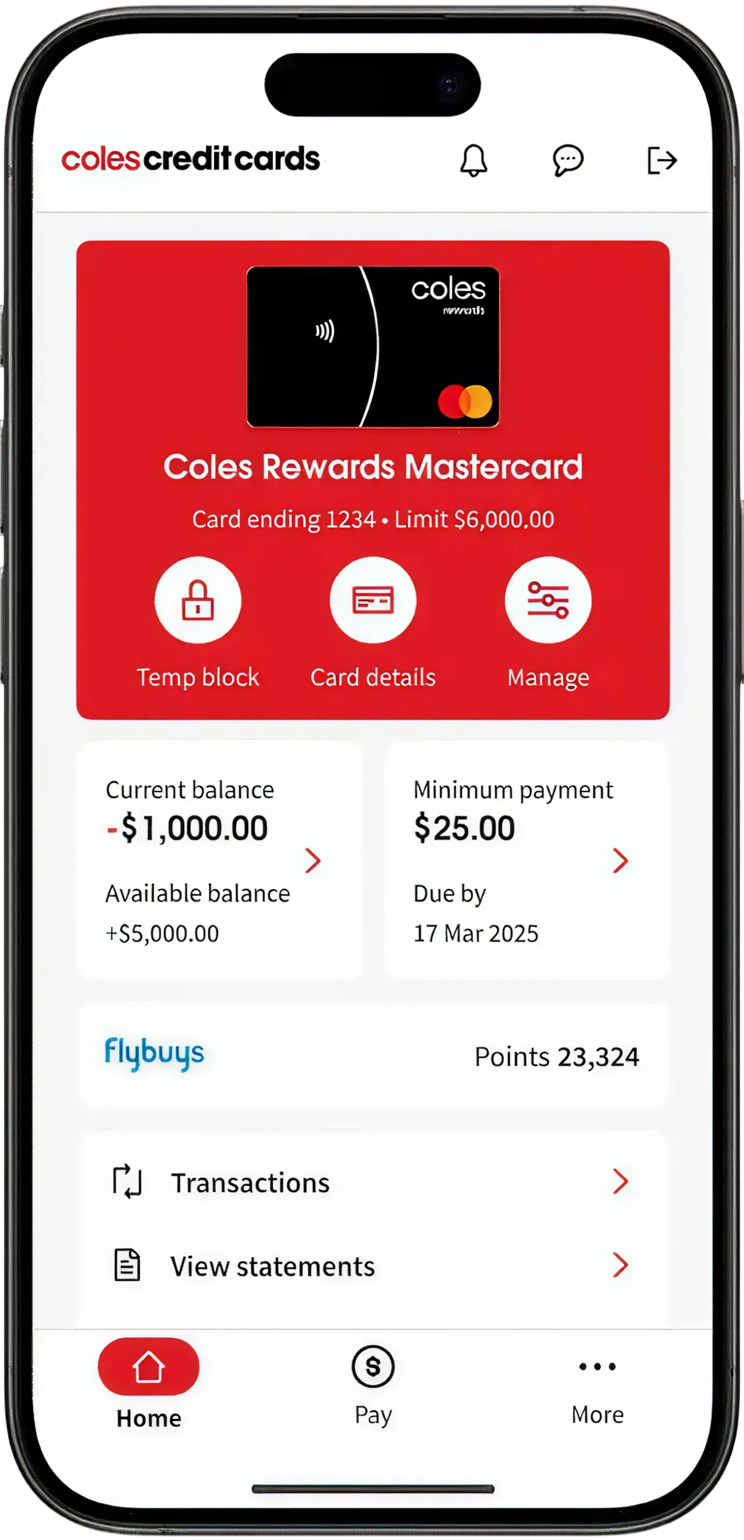
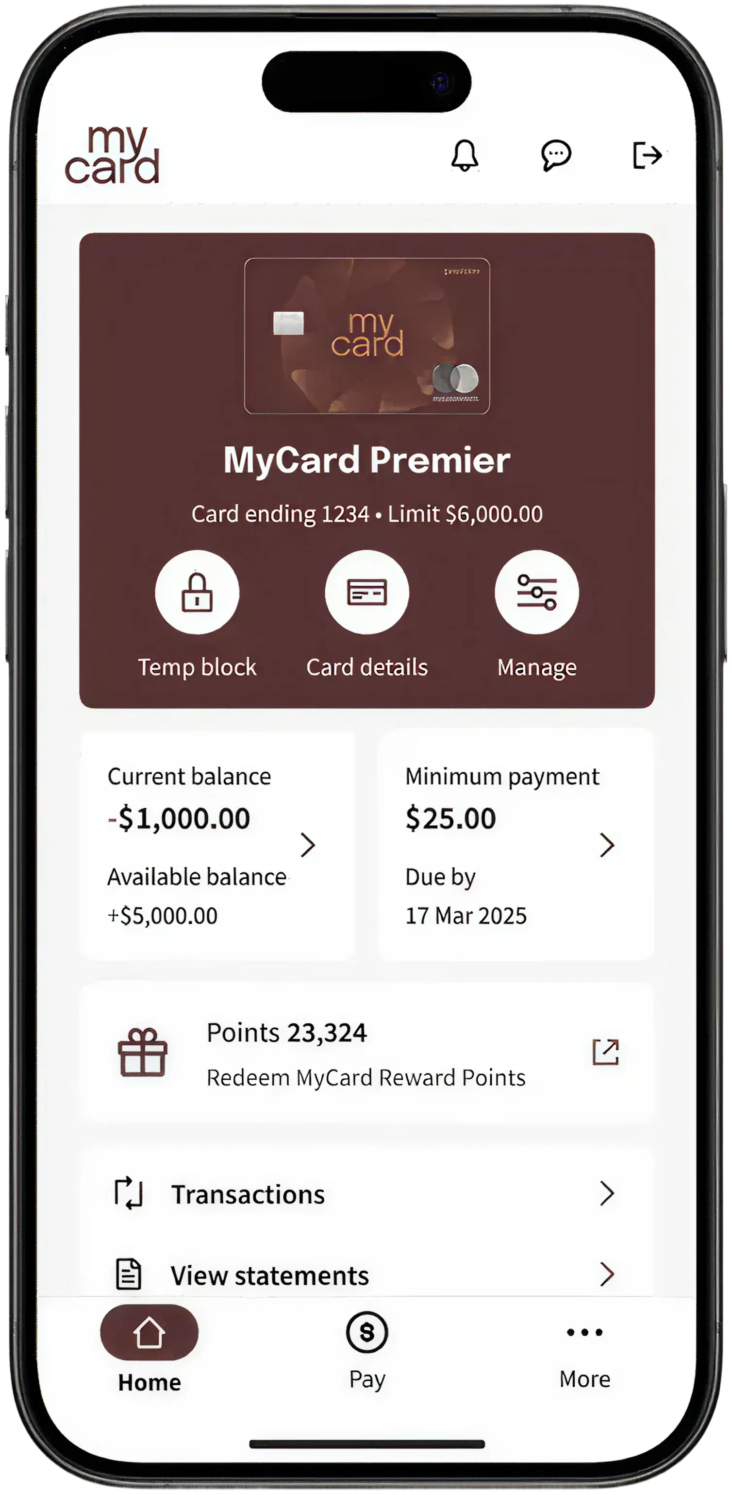
Decision 2: one shell for app and web
Only a handful of screens were React Native (login, home, more menu and pay). Everything else was web. If the seams showed, the “one way” principle failed in the customer’s hands.
I set a single information architecture and navigation model that worked everywhere first, and only then layered in platform-specific behaviour where the experience genuinely needed it. Features can be switched on or off per brand without breaking the architecture.
- Rewards and points appears for Coles only. For every other partner the whole card is switched off and the rest of the menu closes up.
- Profile settings sit in the app menu, and behind the profile icon on web.
- About this app only exists in the app.
Decision 3: flexible, not infinitely flexible
Every partner had a different rewards model: Qantas Points and status, Flybuys, cashback. Building a variant per partner would have fragmented the codebase.
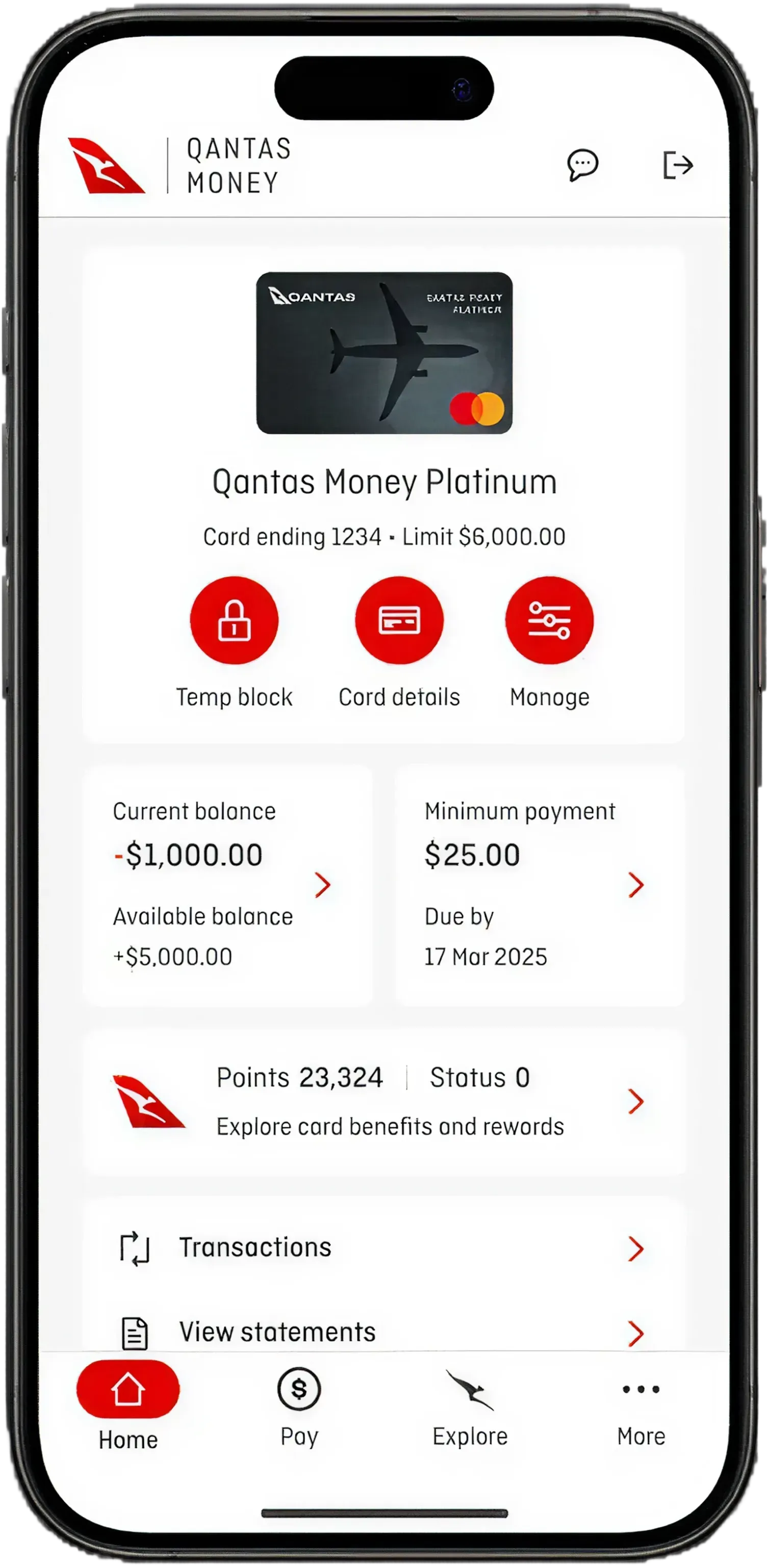
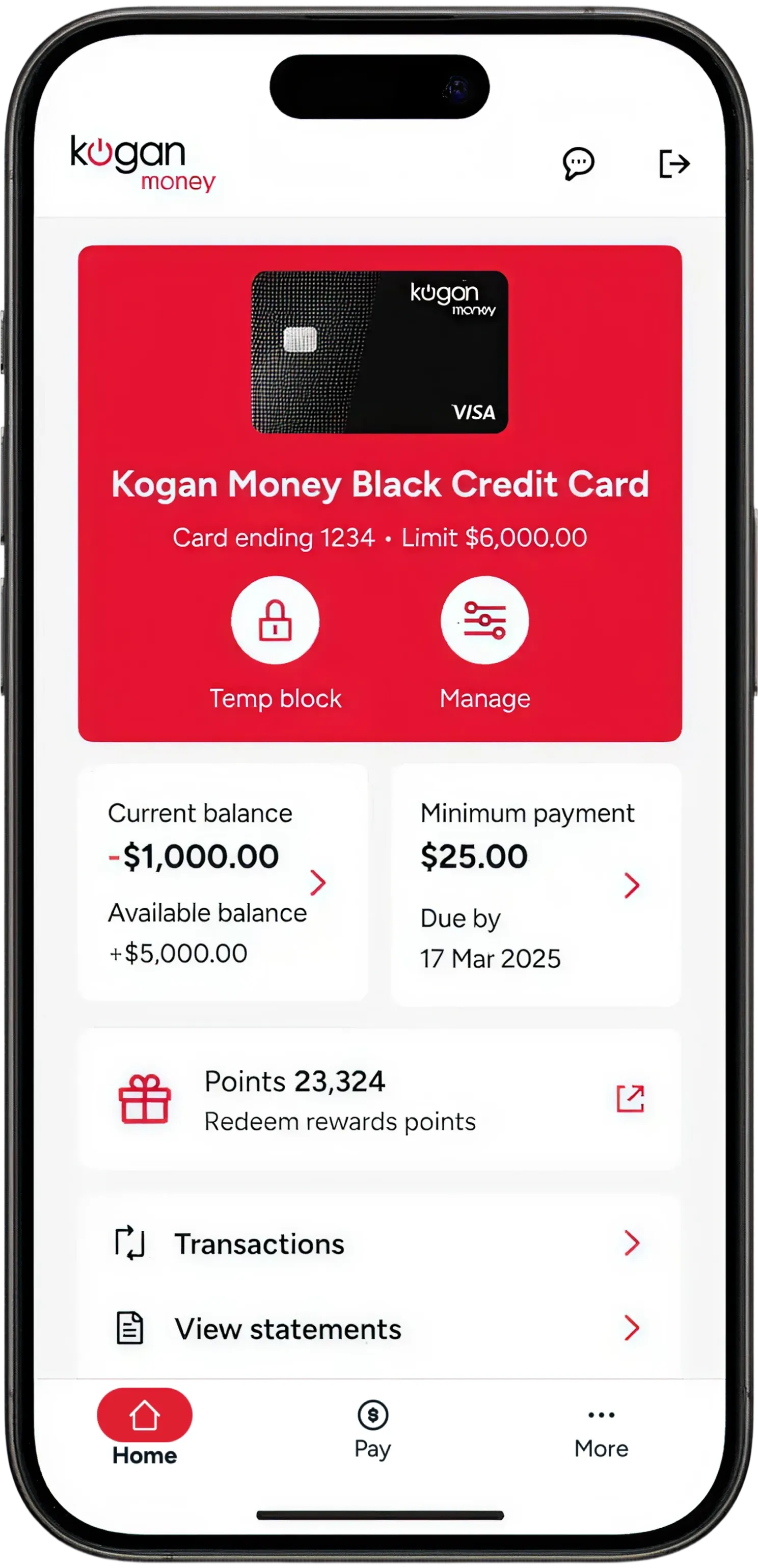
I mapped every partner’s reward model to separate what truly varied from what could be standardised. The result is one rewards tile with controlled variation: brand-specific visual treatment is allowed, structural changes are not. Placement was validated for reachability and agreed with partner brand teams early, which cut late rework.
- Qantas MoneyPoints 23,324Status 0Explore card benefits and rewards
- MyCardPoints 23,324Redeem MyCard Reward Points
- Kogan MoneyPoints 23,324Redeem rewards points
- ColesPoints 23,324


- Fixed layout and points balance
- Varies logo or icon, copy, colour and type
Evidence, not opinion
The shell and the rewards tile were classed as Platinum experiences in NAB’s ExQual framework, the top tier, which requires a score of 4.5 out of 5 with at least 20 participants. Each round was task-based, and every round shaped the next: navigation, hierarchy, component behaviour and content were all refined through testing.
Raising the bar across the team
With 15–20 designers working across partner brands, consistency was the real risk. Part of my role was reviewing the team’s work against the design system, and checking that designs were linked to the right components and tokens is slow, manual work. So I used AI to help me build a Figma plugin that scans frames and flags any colour or font not linked to a token, so designers find and fix everything in one pass. A check that took about 4 minutes per screen now takes about 5 minutes for a whole file. It has been rolled out to several NAB design teams.
Outcome
- Qantas Money, Kogan Money, Coles and MyCard run on the full design and component foundation. Virgin Money and Bank of Queensland also partner on the platform through its APIs. It supports NAB’s position as Australia’s largest credit card provider.
- One design and component foundation serves four distinct brands without duplicated design or development.
- Partner onboarding now ships with brand templates, safe zones and accessibility guardrails built in.
- The work has won four awards for its design process and focus on involving customers: a Good Design Award, a UserTesting Illumi Award (2025), and Gold at the Better Future Awards in both Melbourne 2025 and World 2026.
What I’d do differently
- Build the theming template on day one. I built it after the first partners were onboarded. Starting with it would have saved significant early rework.
- Design in more than one brand from the start. Early on I worked only in NAB’s brand. Some text styles that fit NAB wrapped badly in partner themes. Now I validate across several brands at once.
- Write the constraints down earlier. Mobile-first was the right call, but I’d document and socialise it sooner so the whole team treats it as a constraint.