NAB · MyCard (formerly Citi Australia)
Bringing MyCard to life on a new design system
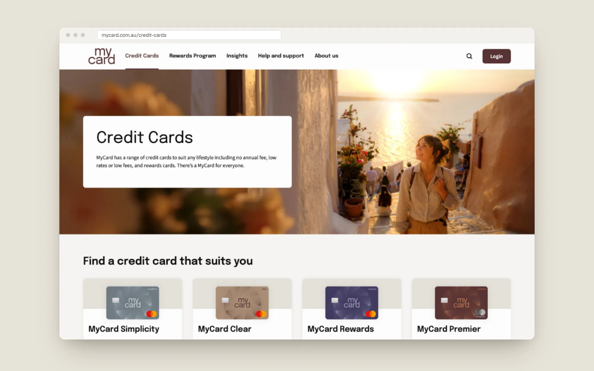
Rebuilding the inherited Citi credit card website as MyCard, on a design system that was still being written, and laying the foundation for NAB's wider web uplift.
- Role
- Senior Product Designer, UI and design system lead
- Team
- NAB design system team, external brand agency and AEM developers
- Timeline
- Post-acquisition rebuild
- Problem
- When NAB acquired Citi's Australian consumer business, the credit card site had to become MyCard on NAB's new, still-evolving design system, and be reusable well beyond MyCard.
- ~3 hrssaved per page with a new way to produce breakpoint designs in Figma
- 8components designed end to end, now the base for NAB's website uplift
- WCAG AAacross every component, after fixing the brand's greys on white
The situation
NAB acquired Citi’s Australian consumer business and inherited its credit card website. The product was renamed MyCard and needed a full rebuild on NAB’s new design system, which was still being defined. It was also an early test case for NAB’s future website uplift, so whatever we built had to scale far beyond one brand.
Decision 1: build for the uplift, not just the launch
The fast option was a MyCard-specific UI kit. I chose to build a full Figma toolkit aligned to NAB’s emerging system instead. I designed 8 components end to end and assisted on many more, built a complete typography hierarchy for AEM (headings, body and link styles), and embedded breakpoint logic in every component. That took more effort up front, but it meant the work could be lifted straight into other NAB sites.
It worked. The MyCard toolkit is now the base for NAB’s broader website uplift.
Decision 2: make the brand accessible without losing it
The MyCard brand came from an external agency, and its greys failed contrast on white. I ran WCAG AA checks across the palette and adjusted those greys until every pairing passed, then translated the brand into tokens, styles and components so accessibility was the default rather than something to remember.
Decision 3: stop drawing every breakpoint by hand
Designing each page at every breakpoint meant rebuilding the same layouts over and over. I created a new way to produce breakpoint designs in Figma, driven by the responsive logic built into the components, which saved about 3 hours per page.
Decision 4: co-design the system, don’t wait for it
MyCard was one of the first major projects on the new system, so many patterns didn’t exist yet. I worked closely with the system team to define them as we went, and with developers to make sure each component was feasible in AEM and built as designed.
Outcome
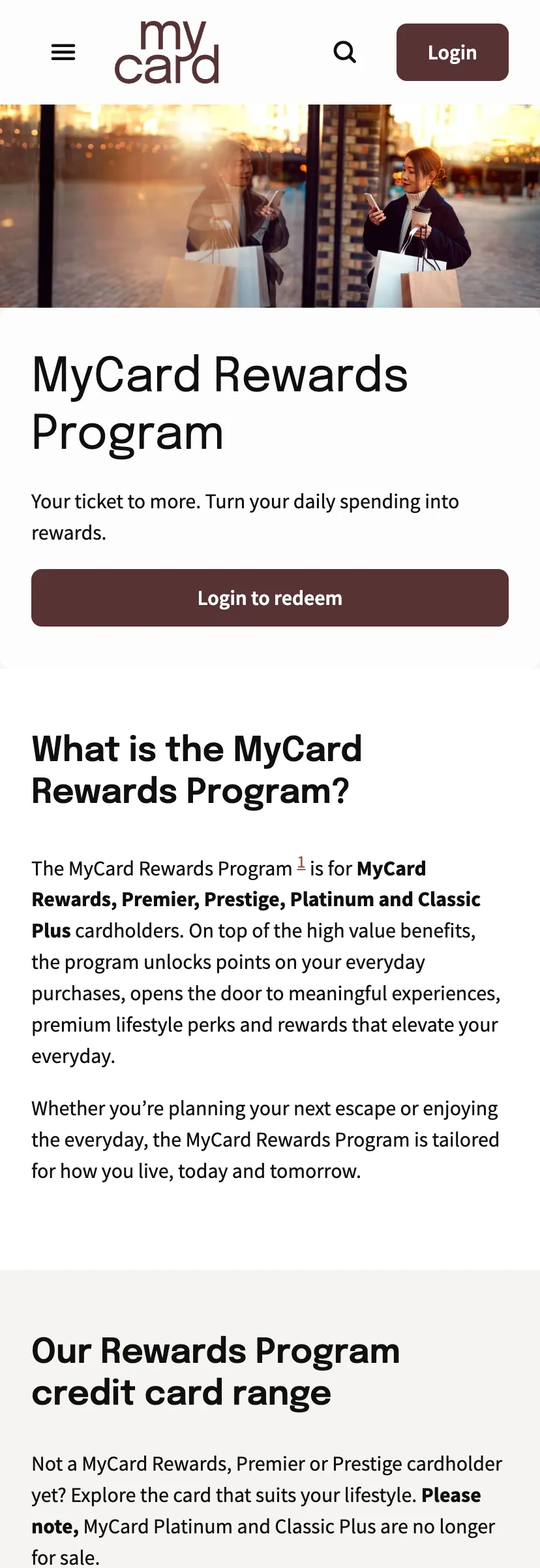
- Reused across NAB. The 8 components I designed end to end, and the wider toolkit, became the starting point for NAB’s broader website uplift.
- Accessible by default. Every component and brand element meets WCAG AA, including the corrected greys.
- Faster design. The new breakpoint method saves about 3 hours per page and keeps layouts consistent across teams.