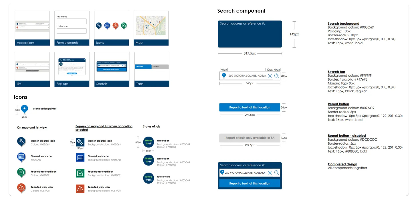
SA Water · Fault map
Is my area affected?
A responsive fault map that tells South Australians, in seconds, whether an outage affects them and when it will be fixed.
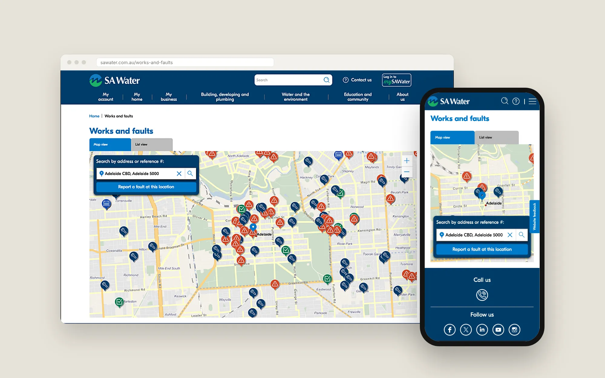
- Role
- Lead UX and UI designer, from proof of concept to final design
- Team
- Cross-functional SA Water product team
- Timeline
- Proof of concept through launch
- Problem
- Reporting a fault meant filling in a basic form with no map or visuals, and customers couldn't tell if an outage affected them or when it would be fixed.
- 87System Usability Scale score, rated excellent
- Form → mapone page to view, report and subscribe to faults, replacing a basic form
- Reusedpattern library that keeps future SA Water work consistent
The question that mattered
Before this project, the only way to tell SA Water about a fault was a basic web form. There was no map, no way to see what was already known, and no visual sign of whether your street was affected.
People look for this information when something has already gone wrong. They’re stressed and want one answer fast: is my area affected? The goal was a single page where customers could view, report and subscribe to faults.
What research changed
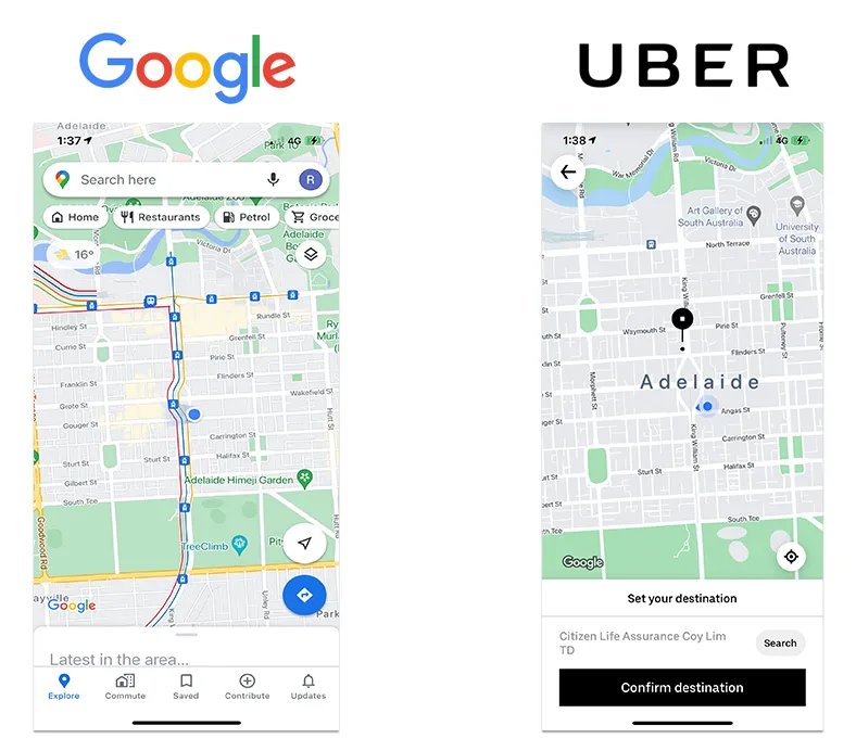
Before designing, I reviewed other mapping products. Three findings shaped everything:
- Customers want immediate confirmation of whether they’re affected.
- Extra map detail increases cognitive load.
- Status and time to resolution matter far more than technical fault detail.
Decision: read-first, not control-first
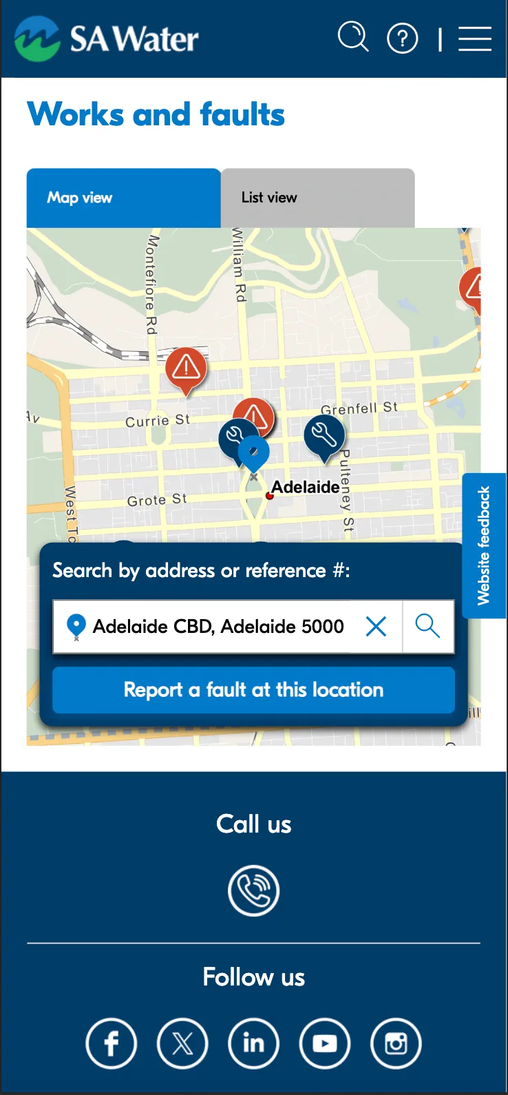
Early concepts leaned into map interaction and filtering. Testing showed customers valued speed and clarity over control, so I simplified to a read-first experience built around one journey: find my address, see my status.
The flows below set out every route through the page. Viewing a fault and reporting one start from the same map or list, so customers never have to leave the page they landed on.
Viewing or subscribing to a fault
- Start
- Fault map view⇅Fault list view
- Select fault Close: back to map or list
- Subscribe to fault Go back: to the fault
- Subscribe
- End
Reporting a fault
- Start
- Fault map view⇅Fault list view
- Report a fault
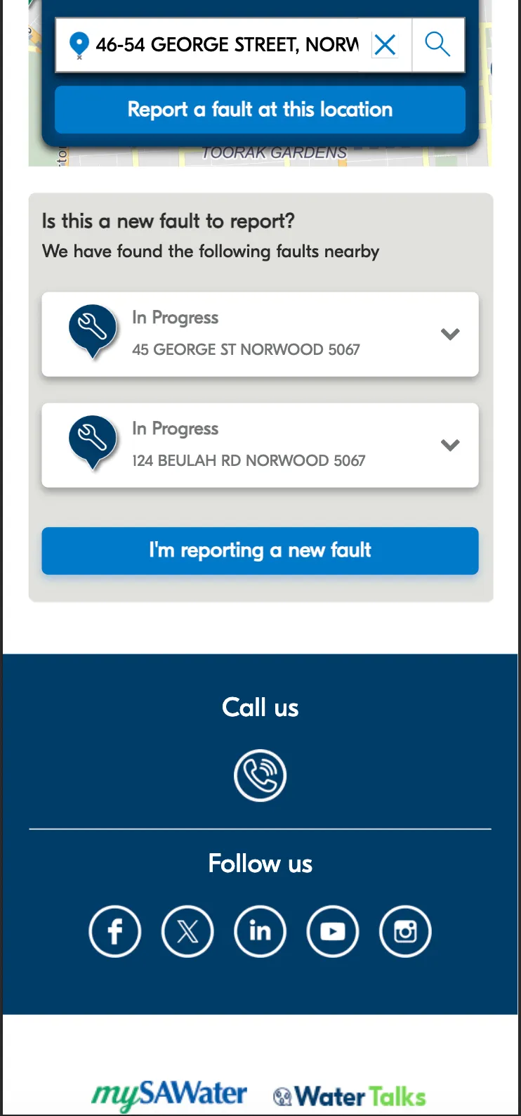
- New or existing fault Existing fault: see its status, then end
- New fault
- Select options If urgent: call SA Water
- Fault & contact details
- Submit fault
- Thank you
- End
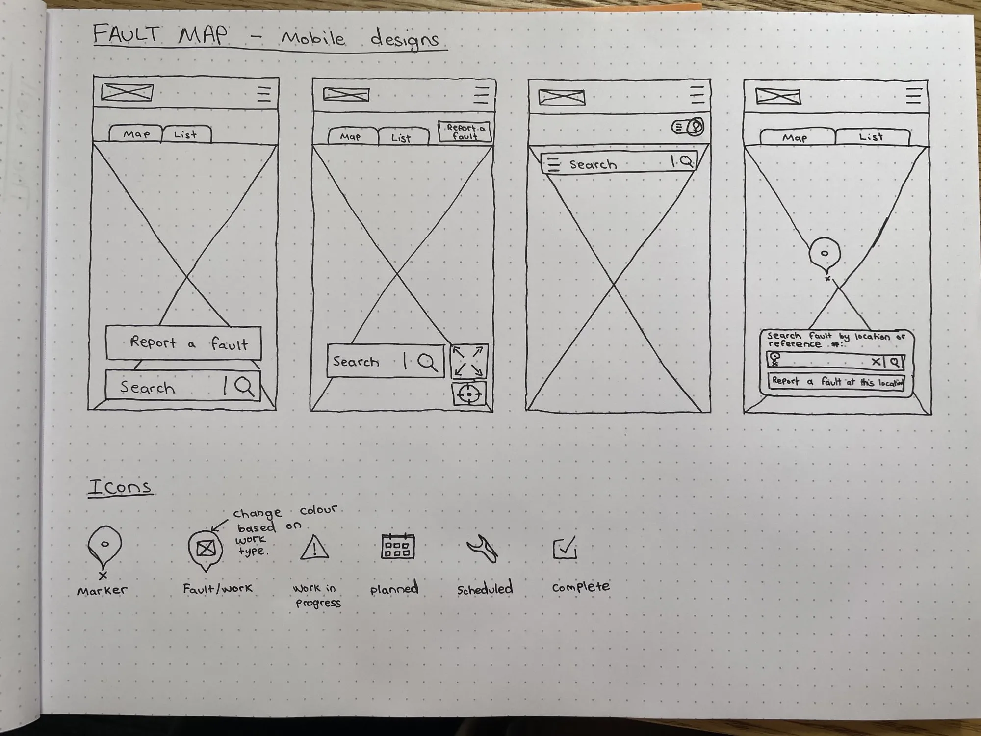
Mid-fidelity wireframes
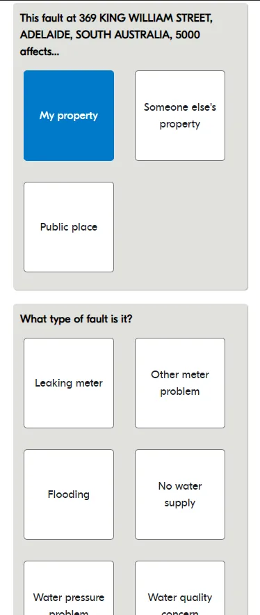
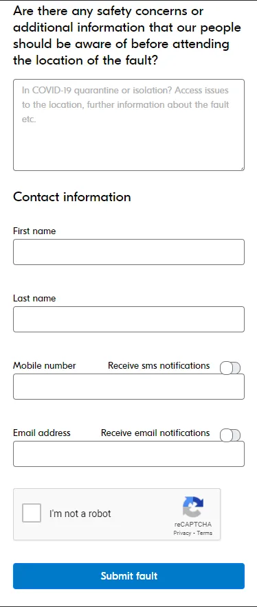
Once I knew which screens were needed, I wireframed each flow in detail and built prototypes to test with customers. The report flow reveals one question at a time, and the options change based on earlier answers.
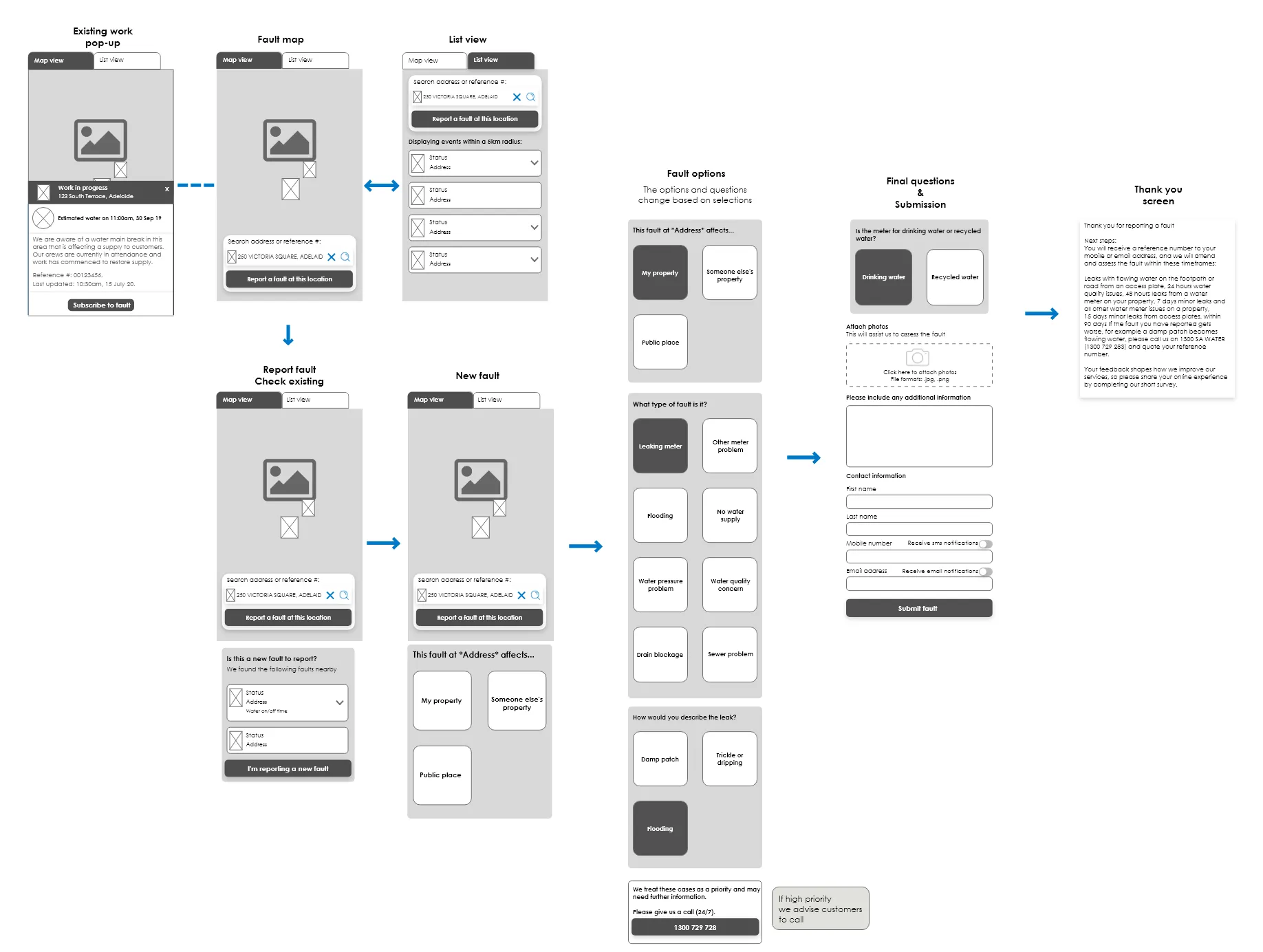
Testing sharpened the hierarchy
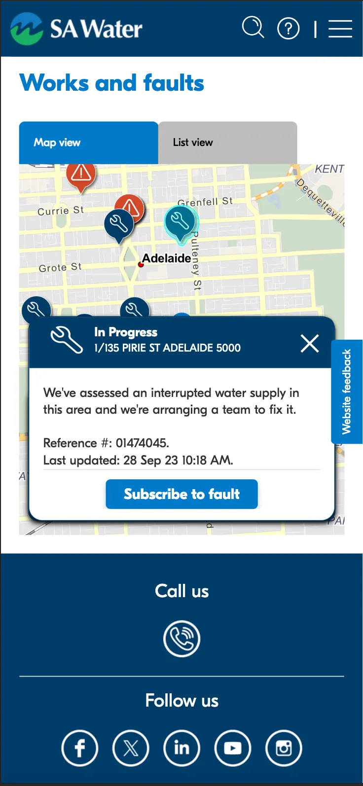
Mid-fidelity prototype testing showed people were missing secondary fault details. I increased the visual weight of status and timing, which is what customers actually came for. The revealing report-a-fault form was tested and refined step by step.
High-fidelity mock-ups
Outcome
The fault map scored 87 on the System Usability Scale, an excellent rating. It gives customers fast, clear visibility of faults across devices in high-stress moments, and the pattern library I produced keeps future work consistent.